
Customer Satisfaction Enhancement
Fannie Mae is a government-sponsored enterprise that plays a key role in the U.S. housing finance system. As an employee of Fannie Mae, I was tasked with collaborating with multiple internal teams, to learn and discover their daily tasks, wants and needs, and provide enhanced UI and experiences by leveraging their design system, Blueprint’s, components and principles, along with my own expertise and guidance.
For this project, the Multifamily Product Management Group began an innovation challenge with multiple teams. The Servicing team participated in this challenge, and were tasked with investigating innovation opportunities and capturing the results. If the opportunity discovered holds merit, the project could be prioritized and incorporated into sprint planning for the next project iteration planning session. The manager of Payment Orchestration System(POS) application sends out bi-annual feedback surveys to the Servicing and Acquisitions teams within Fannie Mae. This manager was already receiving negative feedback on one of the task flows of POS, so they found this as a great opportunity to revisit the interface and orientation of the POS application. Specifically, the task flow of creating transactions.
The Create Transaction function of POS was regularly given negative feedback based on the user feedback surveys that were sent out on a bi-annual basis. Users made frequent comments about the workflow, calling it slow, clunky, and cumbersome. Many sequential steps are required to create a single transaction, increasing time on task, and reducing the accumulated scores of the feedback surveys.
Role
User Interface and User Experience Designer
Tools
Figma(Design and FigJam), Jira, Microsoft Teams
Platform
Desktop (PC), Browser
Year
2025
Where we started
Payment Orchestration Service(POS) is a common service that facilitates various inbound business transactional fees and outbound property management fees and bills. Through different payment methods, most commonly by wires, or Automated Clearing Houses(ACH).
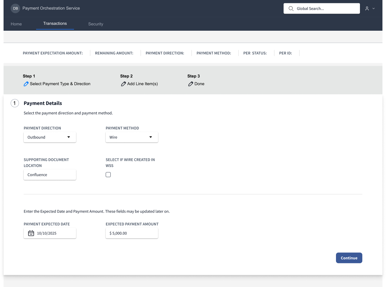
The wireframe above is a recreation of the existing interface. The number of steps would increase based on selections on the Payment Details page(Step 1).
Problem Statement
Because the POS manager was already sending feedback surveys to users before the start of the project, I had plenty of feedback to review. Some of the highlights from the surveys were the following:
- It takes way too long to make transactions.
- There’s just too many pages I have to go through.
There were many other comments that followed the same kind of cadence. The bottom line is there was a clear problem statement:
Acquisitions and Servicing teams are spending excessive time navigating between multiple pages to verify transaction data, and adding various details to transactions, resulting in increased task time, higher cognitive load, and delayed task completion. There is no centralized view of payment data, forcing users to manually reconcile information across 10+ screens.
Due to the time constraints of this project, I had a few brief conversations with the users of POS before scheduling contextual inquiry sessions with 2 volunteers.
I asked the following questions during our meetings. All of these questions are in relation to the legacy application:
- Can you walk me through your role and primary responsibilities?
- What systems or tools do you use most frequently?
- Can you show me what completing this task looks like?
- What triggers this task?
- What steps take the longest?
- What’s the most frustrating part of this process?
- What do you wish the system did better?
From my interviews I was able to gather the following pain points:
- Ease of use: Users had to navigate back and forth by pressing tab and enter on interface elements to view other pages, which they had to do frequently for data validation.
- Data and information was not readable and readily accessible.
Observations
- Each page of the Create Transaction flow only contained a few inputs. Most of the screen was empty, indicating large amounts of unused screen real estate.
- The layout of the Create Transaction UI was abnormal for Fannie Mae’s design standards, and did not leverage the use of scrolling or data cards.
- I observed both users of POS getting stuck on one particular step of the process. When entering Line Items, users must assign primary and secondary Transaction Codes to the line items. In the existing UI, users must either memorize or access another application to find the required code for the line item. This slows down the taskflow process.
Goals
Most likely, this UI was created before the modern design standards were enforced, making the interface seem confused and compartmentalized within a series of steps. I believe the intention of the interface was not to overwhelm users with inputs and data. This however, made the interface clunky and slow to navigate through. During contextual inquiry sessions(discussed later), the seasoned users were able to speed through the interface, despite its drawbacks, indicating the sequential steps and page separation were unnecessary.
- Provide as much information to the users without overloading the interface.
- Retain existing step by step process but reduce pages, to increase learnability.
- Take advantage of gestalt psychology principles,interface elements and preexisting UI patterns from previous projects to reduce project time and increase delivery speed.
- Maintain cohesion with Fannie Mae’s design system.
- Incorporate functionality to allow users to see a list of existing transaction codes instead of having to search or memorize them.
- Reduce the interaction cost of the taskflow.
- Increase the user survey score rating.
User Objectives
- Complete the create transaction task in a timely manner.
- Receive an improved experience with the POS interface.
Business Objectives
- Reduce the amount of pages and clicks that users need to complete a transaction
- Increase the user survey score rating
Wireframes
Note: Because this work was completed under NDA, I do not have access to the original design files. The wireframes and visuals displayed here are reconstructed from memory and documentation to demonstrate the original problem-solving approach and design decisions.
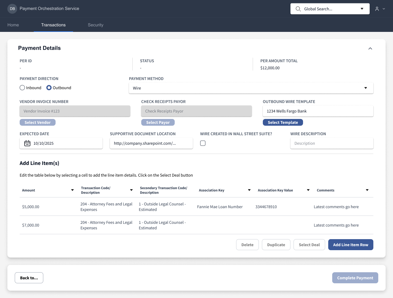
This final wireframe condenses all content(outside of the confirmation page) into a single screen. And the user cannot continue until all required fields are entered.
Create POS - Updated UI
The final design of the Payment Orchestration Service UI condensed 70% of the content in the existing UI into a single screen.
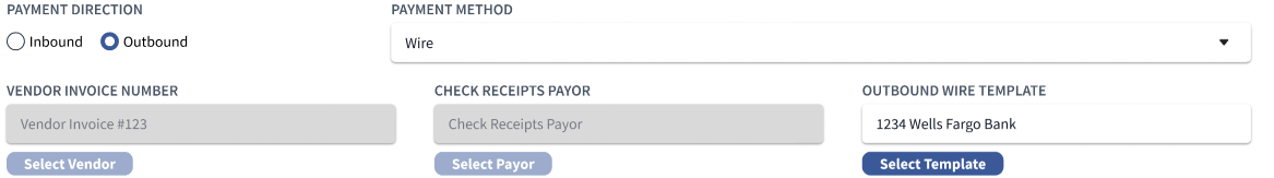
The Payment Direction and Payment Method input fields both influenced the previous flow, creating more pages and steps depending on the selection.
- In the new UI, the interface takes advtange of enabled and disabled component states, so the Vendor Invoice Number, Check Receipts Payor, and Outbound Wire Template fields will enabled or disabled based on the selections.
- This flow is effective, as the user gets immediately interface feedback as they navigate through the UI and enter their required data, they will immediately understand what they can and can’t interact with.
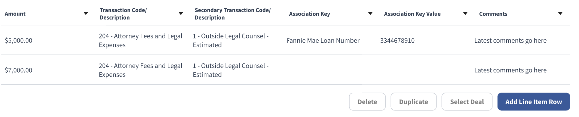
The table above replaces the content of multiple pages, further reducing the number of required screens and clicks.
- The cells within the table are interactable and shift into an editable state when clicked.
- Clicking on the cells within the primary and secondary transaction code columns will open a search and filter menu. Users found this feature to be a create benefit, as it removes the need for memorizing transaction codes or entering another application to look them up, reducing time on task as well.
Outcomes
After I presented the results and findings of the challenge to stakeholders, it was agreed that the assignment was a success, and the enhanced UI that I designed would be incorporated into a future sprint.
Key Performance Indicators
- Reduction in Interaction Cost: Clicks were reduced from 47 to 33, and Screens were reduced from 14 to 5.
- Substantial Increase to Survey Score: Post challenge user feedback surveys were sent out, and users were asked to rate the before and after taskflows on a 5 point scale. The current workflow was rated an average of 2.83. The improved workflow was rated a 4.92.